http://rallues.deviantart.com/

http://rallues.deviantart.com/art/My-Warning-Meant-Nothing-1 69040928
edgy.
In a tasteful way.
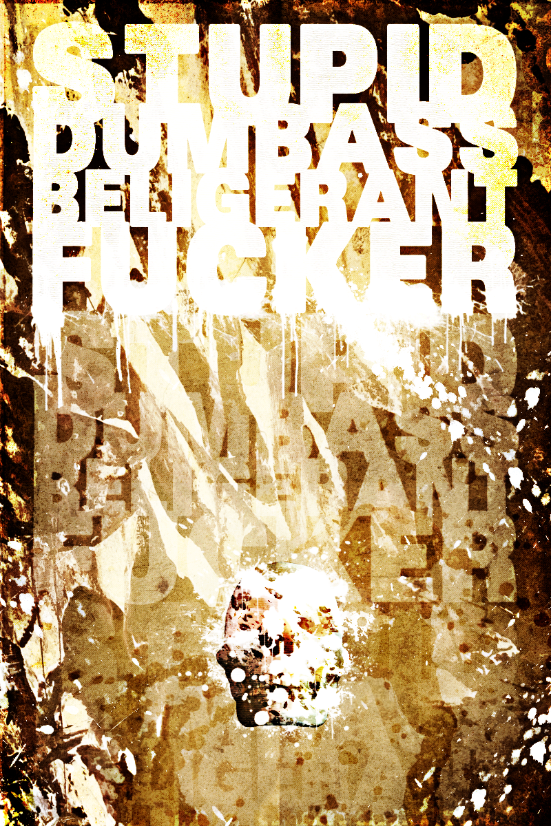
It seems way too busy. I honestly don't like looking at it because of the contrast and the way that the white in the background bleeds into the text.
Also, there doesn't really seem to be a point, so you just come off as some crazy guy screaming about something. What were you going for here?
Look for the thread on encide, explaining twice is kinda exhausting
I thought it was ironic it was a bit hard to read. On dA ive got the lyrics "This blog is thick and easy to get lost in.", then ive got the text, which is an insult, hard to read. The full lyric is "This bog is thick and easy to get lost in when your a stupid dumbass belligerant fucker."
Perhaps im putting way to much hidden meanings in my work
I suppose it makes more sense now, but the problem remains that this piece can't really stand on its own. And it still comes off as screaming.
Im okay with this
I lol'd at this